Key Takeaways
- Most CVs get rejected in under 5 seconds – template choice matters more than you think.
- ATS systems kill around 75% of applications before human eyes see them.
- Clean, single-column layouts with proper headers beat fancy designs every time.
- Your LinkedIn profile already contains 80% of what recruiters want to see.
- Font choice, white space, and header structure can make or break your application.
Ready to stop wasting time? Paste your LinkedIn profile link – build ATS CV in 5 minutes with Linked CV Builder.

Look, I'm gonna be honest with you. Most CV templates out there are garbage.
They look pretty in Canva. They've got those cool two-column layouts, fancy icons, progress bars for your skills (seriously, who thought that was a good idea?), and colors that pop. Problem is... they're designed to impress other designers, not hiring managers. And they definitely don't play nice with ATS software.
You know what happens when you submit one of those Instagram-worthy resumes? It gets shredded by the Applicant Tracking System before Karen from HR even opens her coffee.
The 5-Second Reality Check
Here's something that'll keep you up at night: recruiters spend an average of 5-7 seconds on initial CV screening.
Five. Seconds.
That's less time than it takes to microwave leftovers. In that blink, they're scanning for specific things – job titles that match, relevant companies, education credentials, key skills. If your template buries this info under creative formatting or splits it across multiple columns, you're toast.
I tested this myself last year when I was helping my sister job hunt. Sent out 50 applications with her "beautiful" two-column template. Got 3 responses. Switched to a boring, ATS-friendly single-column layout. Same experience, same jobs, same cover letters.
18 responses.
Yeah.
What Makes a Template Actually ATS-Friendly?
Forget what design blogs tell you about "standing out." ATS systems are dumb. Like, really dumb. They're scanning your CV like it's 1995, looking for plain text and standard formatting.
Single-column layout – This is non-negotiable. Two columns confuse the parser, and suddenly your "Skills" section ends up in your "Work Experience." I've seen it happen.
Standard fonts – Arial, Calibri, Helvetica, Times New Roman. Boring? Absolutely. Effective? You bet. That custom font you downloaded might look slick but ATS software will spit it out as gibberish.
Clear section headers – Use obvious labels. "Professional Experience" not "Where I've Made My Mark" or whatever creative nonsense LinkedIn influencers suggest. ATS systems search for specific keywords in headers.
No text boxes, tables, or graphics – These are invisible to most ATS systems. Your carefully crafted table of skills? Might as well not exist.
Simple bullet points – Standard rounds or squares. Not custom icons, not checkmarks, not stars.
Maybe you're thinking this sounds incredibly bland. You're right, it does. But you know what's more bland? Not getting interviews.
The Templates That Actually Work in 2026
After looking at hundreds of successful applications and talking to recruiters who actually review these things... here are the layouts that consistently perform.
The Classic Reverse-Chronological
This is the workhorse. Name and contact info at the top, professional summary (2-3 lines max), work experience in reverse chronological order, education, skills at the bottom.
Nothing fancy. But here's why it works – ATS systems are trained on millions of resumes, and this format is what they know. You're speaking their language.
Plus, recruiters can scan it in those precious 5 seconds. They look at your current/most recent role first, which is exactly where their eyes land.
The Hybrid (Combination) Format
This works for career changers or people with gaps. You lead with a skills summary section, then move into reverse-chronological experience.
The trick? That skills section needs to be SHORT. Three to four bullet points max. Any more and you're just padding, and recruiters know it.
I like this one for tech roles where you need to showcase specific programming languages or certifications upfront. Just make sure those skills match the job description – like, exactly match. Copy-paste the terminology they use.
The Minimal Modern
Clean, lots of white space, subtle use of a single accent color for headers (and I mean subtle – we're talking a navy blue or dark gray, not neon pink).
This template shows you understand modern design principles without sacrificing ATS compatibility. Single column, standard fonts, clear hierarchy.
The white space is doing heavy lifting here. Makes the page breathable, guides the eye naturally down the page. Too many people cram everything in, terrified of a second page. But honestly? Two pages is fine if you have 10+ years experience. One page with tiny fonts and no margins looks desperate.
What About Creative Industries?
Yeah, design, marketing, creative roles... I get it. You want to show personality.
Here's my take: have TWO versions of your CV.
One that's ATS-friendly for when you're applying through company portals and LinkedIn (which is most applications). Another that's more visually interesting for when you're networking, sending directly to hiring managers, or bringing to interviews.
The boring version gets you in the door. The creative version reminds them why they called you in.
But even creative CVs should follow basic readability rules. If I can't find your contact info in 2 seconds, your design has failed.
The Font Situation
Let's talk fonts because people obsess over this.
Best choices:
- Calibri (it's the default for a reason).
- Arial (clean, universally readable).
- Helvetica (if you're feeling fancy).
- Garamond (surprisingly good for print).
Size matters: 10.5-12pt for body text, 14-16pt for your name, 11-13pt for section headers. Anything smaller than 10pt and you're making recruiters squint. Anything bigger than 12pt and it looks like a kid's school project.
I see people using Trebuchet or Georgia trying to be different. Stop it. Nobody cares about your font choice, and some ATS systems handle them weirdly.
Structure That Passes the 5-Second Test
The top third of your first page is prime real estate. Here's what needs to be there:
- Your name (obviously, but you'd be surprised).
- Contact info (phone, email, LinkedIn URL, location – just city and state, not full address).
- Professional title (what you ARE, not what you want to be).
- 2-3 line professional summary (optional but recommended).
That's it. No objective statements (it's 2026, we know your objective is to get the job). No photos unless you're in a country where that's standard. No full street address because that's weirdly personal and irrelevant.
Then immediately into your most recent experience. They should be able to glance and see your current/last role, company name, dates, and 2-3 key achievements in those 5 seconds.
Keywords: The Game You Have to Play
Every job posting is basically a treasure map of keywords. The ATS system is scanning for those exact terms.
"Project management" vs "managed projects" might seem the same to you, but to an ATS they're different. If the posting says "project management," use those exact words.
This is where most people mess up. They write their CV once and blast it everywhere. But the ATS requirements change with every job posting.
Here's what works: Keep a master CV with everything you've ever done. Then for each application, customize it. Pull the keywords from the job posting – the skills, the requirements, the "nice to haves" – and make sure those appear in your CV where they honestly apply.
I know it sounds like a lot of work. It is. But would you rather spend 15 minutes customizing or send out 50 generic applications and get nothing back?
The LinkedIn Shortcut
Real talk – your LinkedIn profile probably already has 80% of what you need.
If you've kept it updated, the experience is there, the skills are there, the recommendations might even be there. The problem is formatting it into an ATS-friendly template and customizing it for each specific role.
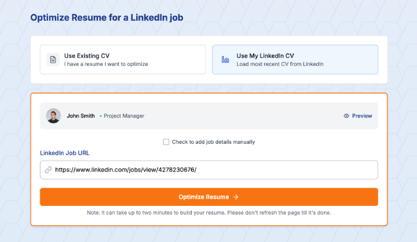
This is where tools like Linked CV Builder actually make sense. You paste your LinkedIn profile, it pulls everything into a clean template, and then you can quickly customize it for specific jobs. The AI even suggests skills you might have forgotten to add.
I used to think these tools were gimmicky, but when you're applying to multiple positions... the time savings add up fast. Plus their template is specifically designed for that 5-second test and ATS compatibility, which is the whole point here.
Common Template Mistakes That Kill Your Application
Mistake #1: Creative headers "My Professional Journey" instead of "Work Experience." ATS systems don't find your journey cute.
Mistake #2: Splitting experience across columns Left column has your company names, right column has your roles. Looks organized to humans, looks like chaos to ATS.
Mistake #3: Using text boxes Seriously, ATS can't read them. They're invisible. You might as well leave that section blank.
Mistake #4: Tables for anything Same problem as text boxes. The parsing gets confused and your information ends up jumbled or missing entirely.
Mistake #5: Headers and footers Some ATS systems ignore these completely. Don't put important info there. Your name and page number are fine, but contact details should be in the main document body.
Mistake #6: Saved as the wrong file type Unless they specifically ask for PDF, send a .docx. Some older ATS systems choke on PDFs. I know, it's 2026, but corporate software updates slowly.
Testing Your Template
Before you send your CV anywhere, test it:
- Copy all the text and paste it into a plain text editor. Does it still make sense? Is information in the right order? That's roughly what ATS sees.
- Run it through a free ATS checker (several exist online). They're not perfect but give you a sense of how machine-readable your CV is.
- Email it to yourself and open it on your phone. If it's hard to read on mobile, it's probably poorly formatted. Lots of recruiters do quick scans on their phones.
- Print it in black and white. Does the hierarchy still make sense? Can you quickly identify the most important information?
The Cover Letter Template Question
Quick tangent – cover letters need to be ATS-friendly too.
Same rules apply. Single column, standard fonts, clear paragraphs. Don't get creative with the layout.
Three paragraphs is plenty: why you're interested, why you're qualified, what you bring. Keep it under 350 words. And for the love of all that is holy, customize it. Generic cover letters are worse than no cover letter.
What About Applicant Tracking Scores?
Some services (including LinkedIn's built-in tools) give your CV a "score" for how well it matches a job posting.
These are useful but not gospel. They're checking keyword matches, formatting issues, and completeness. A score of 75% doesn't mean you have a 75% chance of getting the job – it means your CV has 75% of the keywords they're scanning for.
Still worth checking though. If you're scoring below 60%, you're probably missing critical keywords or have formatting problems.
The Real Advantage of a Solid Template
Here's what nobody tells you: a good template isn't about gaming the system. It's about respect for the reader's time.
Recruiters are scanning dozens, sometimes hundreds of CVs. Make their job easier and they'll think more favorably of you. It's subtle but it matters.
Clear formatting says "I'm organized and I understand how to communicate professionally." Messy formatting says "I didn't care enough to clean this up."
Your experience and skills get you the interview. The template just makes sure those qualifications are seen.
Final Thoughts (Sort of)
The truth is, CV templates aren't exciting. They shouldn't be. They're functional documents with one job: getting you to the interview stage.
Save your creativity for the interview, for your portfolio, for the work you'll do once you're hired. The CV is just the door. A well-designed, ATS-friendly template is the key.
Will the perfect template guarantee you interviews? No. You still need the actual qualifications and experience. But a bad template can definitely cost you opportunities you deserve.
So use something clean, simple, and proven to work with ATS systems. Customize it for each application – pull those keywords, match the language they use.
And maybe stop overthinking the fonts.
Stop guessing if your CV will make it through ATS. Build an optimized CV from your LinkedIn profile in 5 minutes – because applying to jobs is already exhausting enough.
Written by Di Reshtei