Key Takeaways
- Classic templates still dominate corporate and traditional industries (finance, law, government).
- Modern designs work better for creative fields but can confuse ATS systems.
- The "5-second rule" matters more than your template choice.
- Most rejections happen because of poor content, not template style.
- Hybrid approaches are becoming the safe bet for 2026.
Ready to skip the guesswork? Paste your LinkedIn profile link – build ATS CV in 5 minutes with Linked CV Builder.

Look, I'm gonna be straight with you. The whole modern vs classic CV debate? It's kinda exhausting at this point.
Everyone acts like choosing between a sleek two-column design and a boring traditional layout is this massive career decision. And yeah... it matters. But probably not in the way you think.
Here's what actually happens: HR gives your CV about 5 seconds before deciding if you're worth a closer look. Five seconds! That's barely enough time to read your name and job title. So whether your template has a splash of color or looks like it was made in 1987 Word... honestly that's secondary to whether they can instantly see you're qualified.
But let's dig into this anyway because the template wars are real and you deserve to know what works.
What Even Counts as "Modern" Anymore?
Modern CVs usually mean:
- Two or three column layouts.
- Icons for contact info and skills.
- Color accents (usually one or two colors max).
- Charts or progress bars for skill levels.
- Creative headers with your photo maybe.
- Sans-serif fonts like Calibri or Helvetica.
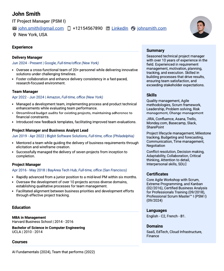
Classic templates are the opposite. Single column, black text on white, Times New Roman or Arial if you're feeling adventurous, zero graphics. The kind of CV your dad would approve of.
The thing is, "modern" doesn't automatically mean better. I've seen incredibly clean modern templates that look professional as hell. I've also seen ones that look like someone discovered Canva for the first time and went absolutely wild with it.
The ATS Problem Nobody Wants to Talk About
Here's where it gets messy.
Most companies use Applicant Tracking Systems to filter CVs before a human ever sees them. These systems are basically robots that scan your CV and decide if you're worth forwarding to HR.
And robots? They're stupid. Like, really stupid.
A modern template with columns, text boxes, headers, footers, and graphics can completely confuse an ATS. It might read your skills section as your work experience. It could skip entire sections because they're in a sidebar. Your beautifully designed CV becomes digital gibberish.
Classic templates parse cleanly every single time. They're boring but they work.
But – and this is important – not every company uses strict ATS screening. Startups often don't. Creative agencies sometimes review CVs manually. Small businesses might just have someone read them directly.
So the "always use classic for ATS" advice isn't universal. It depends on where you're applying.
Industry Matters More Than You'd Think
Finance, law, government, academia, healthcare? Go classic. Like, don't even think about it. These industries value tradition and they're suspicious of anything that looks too flashy. A modern template in these fields screams "I don't understand professional norms here."
Tech, design, marketing, media, startups? You've got more freedom. Modern can actually help you stand out as someone who gets aesthetics and current trends. But even here, don't go overboard.
Here's my controversial take: even in creative fields, a clean classic template won't hurt you if your content is strong. A fancy modern template won't save you if your experience is weak.
Content beats design every time.
The 2026 Reality Check
We're seeing something interesting happen. The best templates now are... neither? They're hybrids.
Think modern aesthetics with classic structure. A clean single-column layout that's easy for ATS to read, but with subtle design touches that make it pleasant for humans to look at. Maybe one accent color. Maybe a simple header. But nothing that would break a parsing algorithm.
These hybrid templates are becoming the standard because they solve both problems. They pass the robot test AND they don't look like they were formatted in 1995.
Companies like Linked CV Builder have figured this out – their templates are optimized for ATS while still looking current and professional. Because honestly, why should you have to choose between getting past the software and impressing the human?
What Actually Gets You Noticed
I'm gonna sound like a broken record here but whatever.
Your template matters less than:
Clear job titles. If you were a "Growth Hacking Ninja," change it to "Marketing Manager" so recruiters actually understand what you did.
Quantified achievements. "Increased sales" is whatever. "Increased sales by 34% over 8 months" is something.
Relevant keywords. Match the job description. If they want "stakeholder management" don't write "worked with partners." Use their exact language.
Readable formatting. Whether modern or classic, use consistent spacing, clear section headers, and a font size above 10pt. Squinting to read your CV isn't impressive.
No weird stuff. Photos (unless you're in Europe where it's normal), personal hobbies that don't matter, references who they haven't asked for yet... cut it.
A classic template with great content beats a modern template with mediocre content literally 100% of the time.
So Which One Should YOU Use?
OK here's my actual advice:
Go classic if:
- You're applying to traditional industries.
- The company is large and definitely uses ATS.
- You're not sure and want the safe option.
- Your experience speaks for itself and you don't need design to compensate.
Go modern if:
- You work in creative/design fields where aesthetics matter.
- You're applying to startups or agencies with relaxed cultures.
- You're early career and need a bit of visual interest since your experience list is short.
- You're certain they review CVs manually.
Go hybrid if:
- You want the best of both worlds.
- You're applying to multiple types of companies.
- You value efficiency over perfect optimization for each application.
Honestly? For most people in 2026, hybrid is the move. It's the "this definitely won't hurt me" option.
The Shortcut Nobody Mentions
Here's something wild: you don't actually have to figure this out yourself.
Tools that convert your LinkedIn profile into a CV (like Linked CV Builder) typically use templates that are already tested for ATS compatibility while looking current. They've done the research on what passes both the robot test and the human eye test.
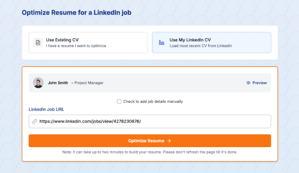
Which means you could spend three hours researching template psychology and ATS algorithms... or you could just paste your LinkedIn profile and have an optimized CV in 5 minutes. I know which one I'd pick.
Final Thoughts (I Guess)
The modern vs classic thing is really about risk tolerance.
Classic templates are low-risk, low-reward. They'll never hurt you but they won't wow anyone either. Modern templates are higher-risk, higher-reward. They might get you noticed or they might get auto-rejected by an ATS.
Hybrid templates are medium-risk, medium-reward – and for most situations in 2026, medium is exactly what you want.
But listen. If your CV has typos, generic bullet points, and no measurable achievements, no template will save you. Fix the content first. Make it scannable in 5 seconds. Make it relevant to the job.
Then pick a template that doesn't actively work against you.
That's it. That's the whole thing.
Stop overthinking your CV design. Paste your LinkedIn profile link and let Linked CV Builder create an ATS-optimized resume in minutes – so you can focus on actually landing interviews instead of formatting debates.
Written by Di Reshtei